Introducing tone
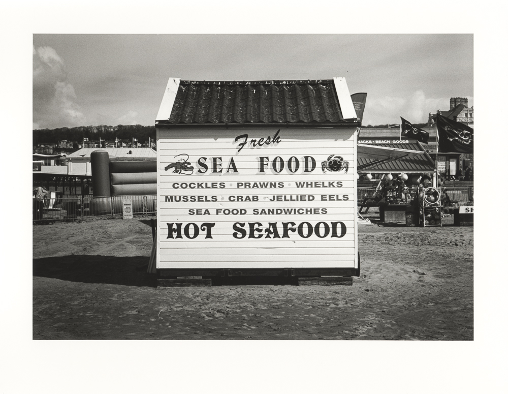
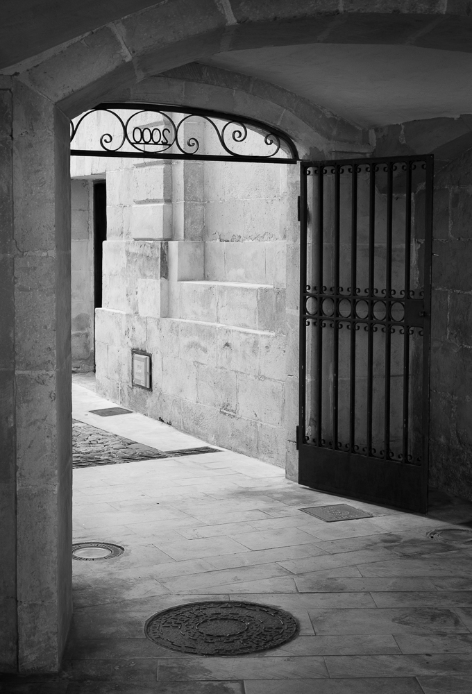
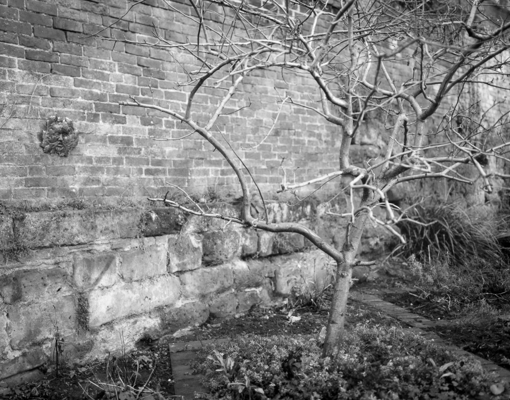
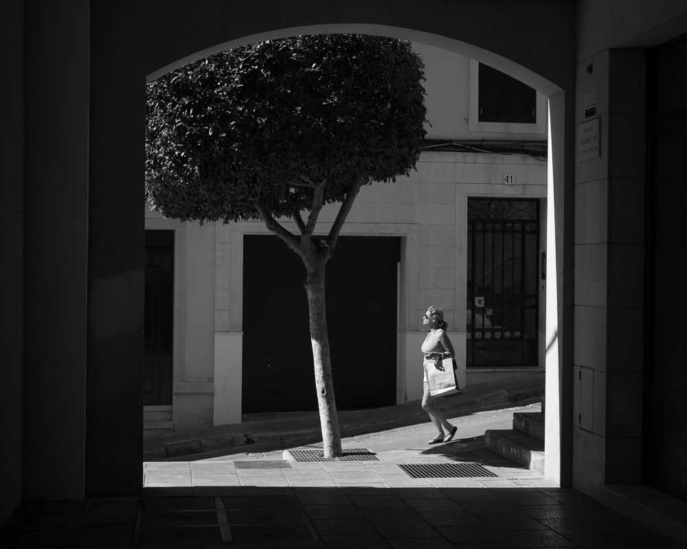
Tone in black and white photography is an effect created by variations in brightness in the image. Prominent or reflective objects in a scene create bright areas, or tones, whereas recesses create shadows. Think of a simple pencil drawing and the way that an artist creates a three dimensional effect. Darker areas are given more shading and therefore darker tones, whereas lighter areas are left to represent brighter patches. Put together, the effect helps to model the objects and creates a sense of space.
Tone as a concept is useful because it helps us to distinguish this particular effect from other elements of picture-making. Shape, line, composition and texture, are different, albeit related aspects. While tone is not the be-all-and-end-all of black and white photography, it is fundamental, and to a large part influences our response to an image. Tone helps to convey the ‘mood’ of photograph, just as tone in a voice or in music conveys a certain feeling or atmosphere. Photographs can be dark and brooding, light and airy, or dominated by muddy greys. The particular combination of tones selected by the photographer determines how we receive the subject of the picture.
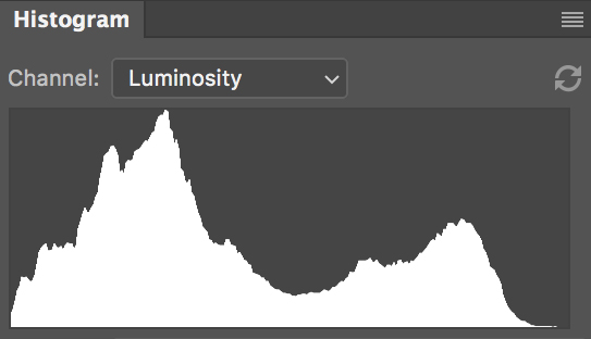
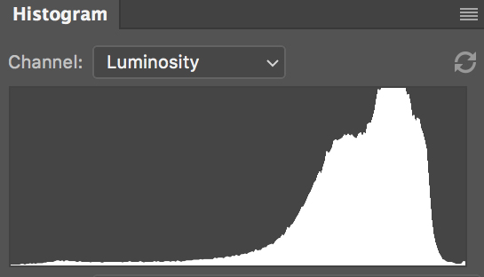
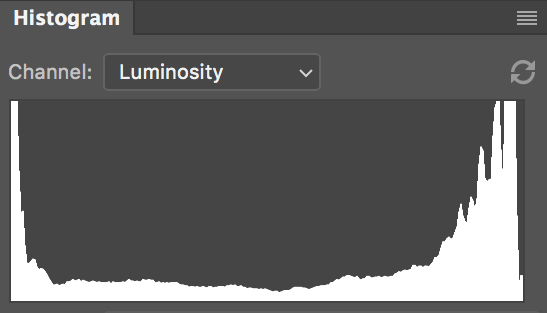
When we speak of tone in photography, we are essentially speaking about a series of different greys (‘pure’ black and white being the exception). It is the photographer’s job to decide how the tones are to be distributed, and hence what mood or atmosphere will be conveyed by the photograph. A photographer learns through technical means to manipulate tone, thus expressing a personal vision. Photographers often refer to the ‘tonality’ of an image. This means how the tones are distributed and, very often, whether an image contains a wide - hence visually satisfying - range of tones.
There are two main things that a black and white photographer must get to grips with. First, how to use the medium (cameras, negatives, paper, software) at hand to create the desired tones; second, an appreciation of what tones will work well in different situations. The first is a technical matter, the second concerns the already existing ‘language’ of photography, and is aesthetic (about how we read and interpret images).
Having the means to manipulate tone is one of the great pleasures of black and white photography. It is what separates the beginner, who is at the mercy of the equipment and its built-in leaning towards mid-greys, and the accomplished photographer, who is able to make the medium ‘talk’.
What follows in the next few posts is a little distilled knowledge from my practice as a black and white photographer. It is my aim to inform you of some key elements that will hopefully set you on a journey towards making better black and white photos. I ask myself simply, if I were starting out in this again, what would I have liked someone to have pointed out to me in the beginning.
I add the usual caveat about a lack of completeness: as you will see, tone is a very big subject that swiftly leads to more very big photography topics. It can’t possibly all be covered in a modest blog series such as this, nor should it. It’s good to think of each element that I raise as something you can investigate much further. If you are experienced in these matters, I hope you will get something from my emphasis and little tips along the way.
Next instalment: a sliding scale of grey