Can you say why you love black and white film in one image?

I asked this question on Twitter the other day and the response has been overwhelming.

So many interesting images were posted by way of reply, and I’ve begun to think they really deserve a home. I’m therefore going to create a gallery blog post, with a little modest commentary (like I did for #Treephotogallery).

If you replied with an image, I’d like your permission to include it in the post. Please send me a direct message on Twitter signalling your permission, or use the contact form on this website. If you have not yet submitted an image and want to, either reply to the original post or get in touch directly. Don’t forget to signal your permission for publication too.

The small print:

Participants agree to publication on this website, and therefore license me, without charge, free and unhindered use of their image. The copyright will of course remain with the photographer. I may not be able to use all images due to space (and time). If your work is not selected, please note this is not a verdict on your work. Naturally, my own eye and preferences will also be at work.

SP-445 Film Processing System

I have a new review over at emulsive.org. It's of the excellent SP-445 sheet film processing tank:

In praise of amateurs

For many of us who engage seriously with photography, we are unavoidably amateurs. We practice photography in our spare time and fund it through our main mode of employment. Without earning a living from photography, we lay no claim to professional status, although we may have ‘professional’ aspirations, and may even make a modest dividend from selling prints or similar.

For some, the term ‘amateur’ will have negative connotations. In this little post I want to argue that it is something we should embrace, a title that conveys significant dignity and, in some senses, status.

The latin root of the word points towards ‘lover’, and so we may think of an amateur as a lover of the medium. An amateur is someone who is able to pursue his or her interests unfettered by the needs of a client, or the conventions of an organised group. Indeed, many amateurs gain considerable expertise in niche areas of photography, simply because of the freedom to pursue exactly what they desire, and to direct their resources to such an end.

There is a tendency for a great many amateurs to look longingly towards professional status. Quality photographic equipment is marketed on the back of these desires. Ironically, much gear that bears the ‘pro’ label is in fact sold to an advanced amateur market. Professionals don’t have it easy. They are shackled by the demands of work and the necessity to marshal resources to make the bottom line pay. They cannot indulge in frivolous purchases, nor can they alter a work schedule to follow an experimental whim. In many ways, they are a lot worse off than those who would aspire to be them.

There is another, more subtle, reason why one might not actually want to aspire to professional status. To be a professional means to speak a very particular aesthetic language. We teach ‘professional’ methods and outcomes to our photography students, but what this really means is ‘make images like this’. Professional images look like, well, other professional images. This is a problem that is well recognised in the visual arts, a problem for which the term ‘academicism’ was coined. We can trace very precisely how the language of fine art developed from the French 18th century academies through to contemporary art today. For the painter in the first academies, to be an academician meant precisely to follow a set pattern of working that very much determined how the painting would turn out. This isn’t to say that there wasn’t any innovation, but the parameters in which you could work were highly codified.

So, for me as a practitioner, the label amateur has a number of attractions. It reminds me of the considerable freedoms I enjoy, both in what I do with photography and how I do it. The medium itself has a special place in my philosophy of photography, and so I find the idea of a lover of the medium to be a description of great dignity. As an amateur, I am free to be as idiosyncratic as I like, an idiosyncrasy that has the potential to lead to aesthetic innovation.

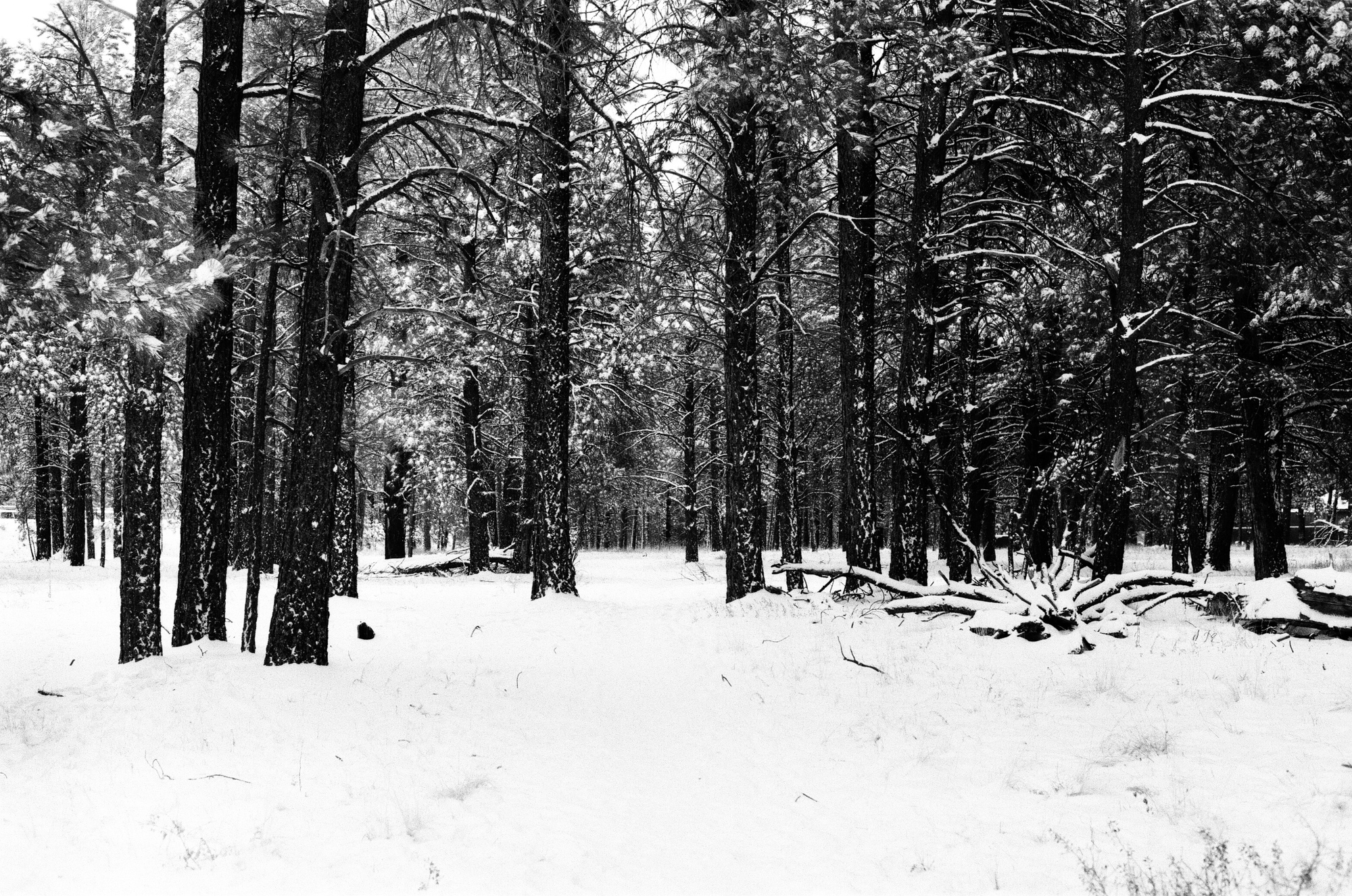
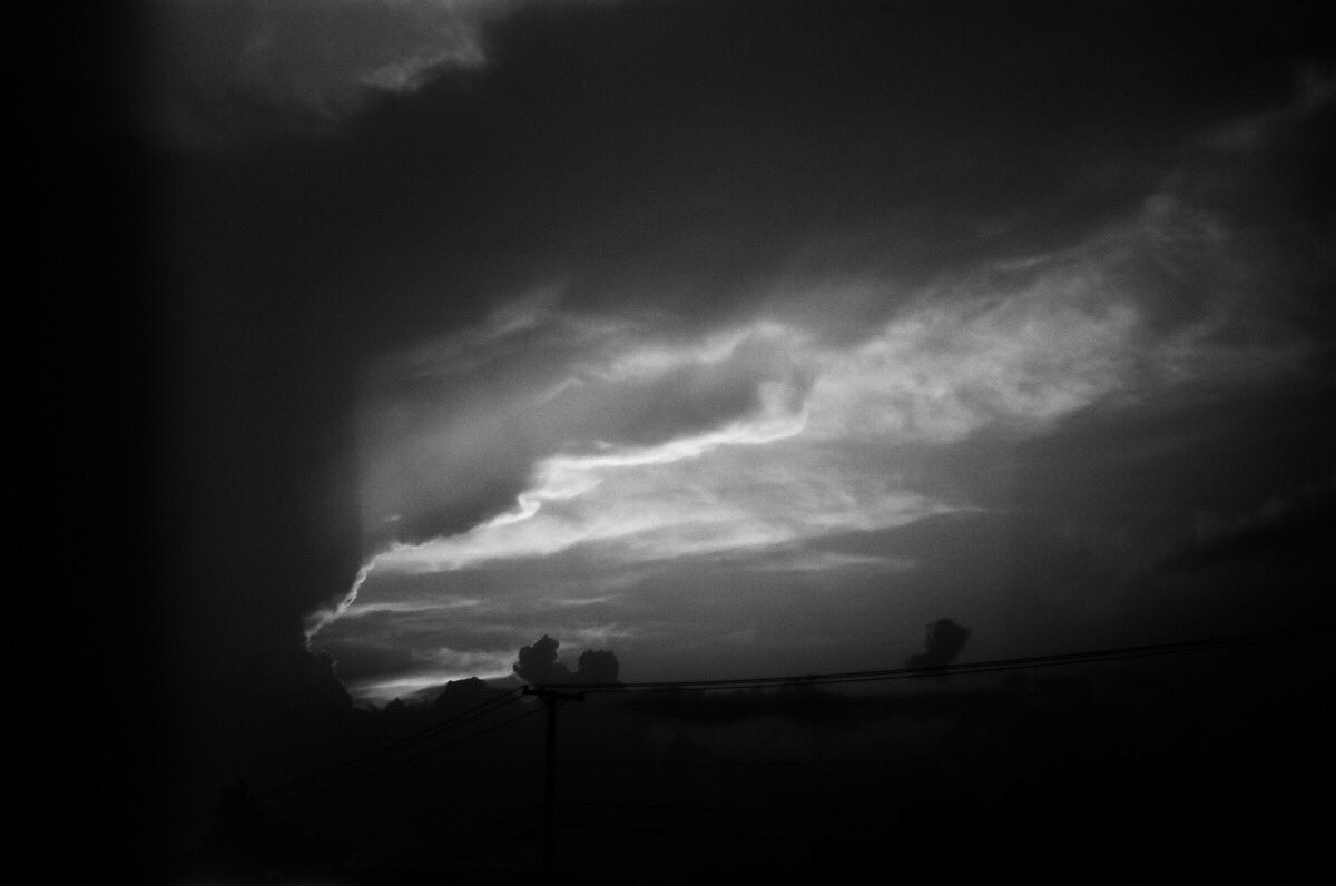
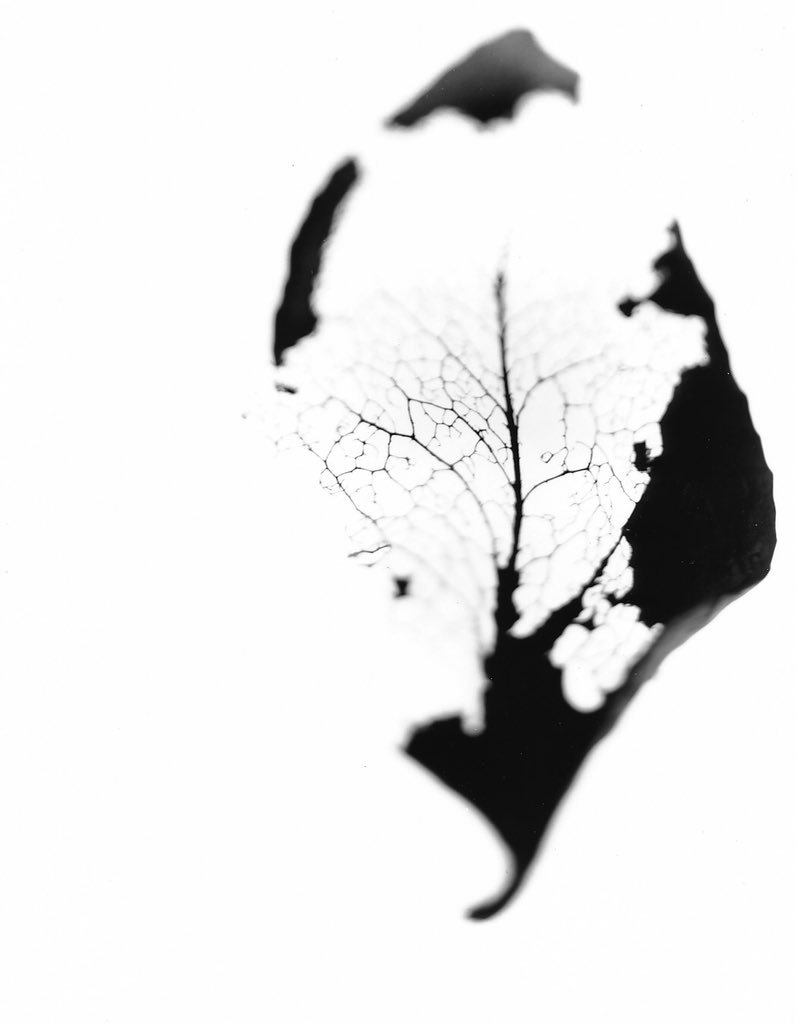
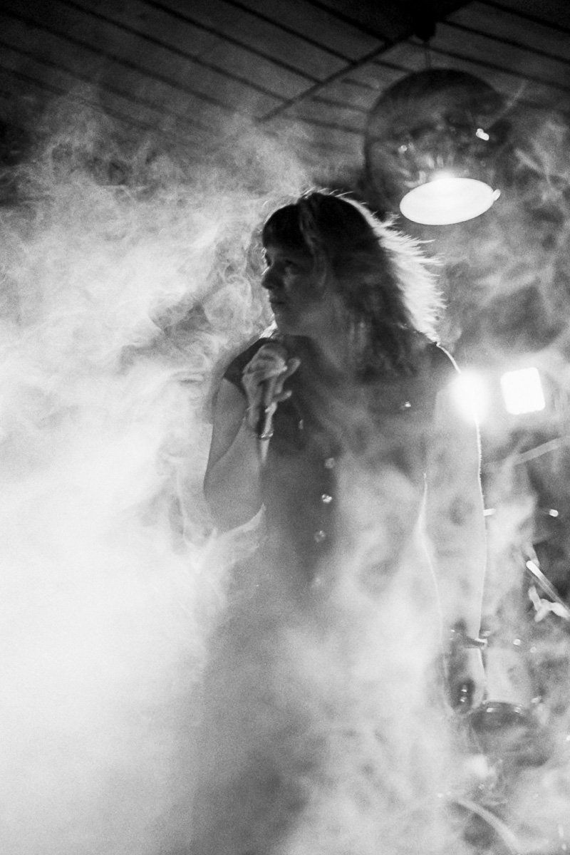
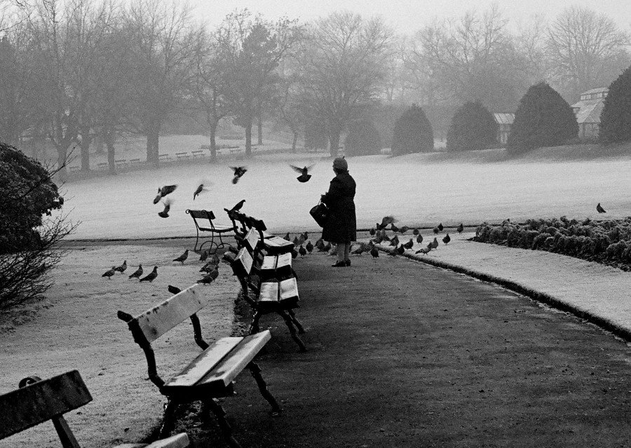
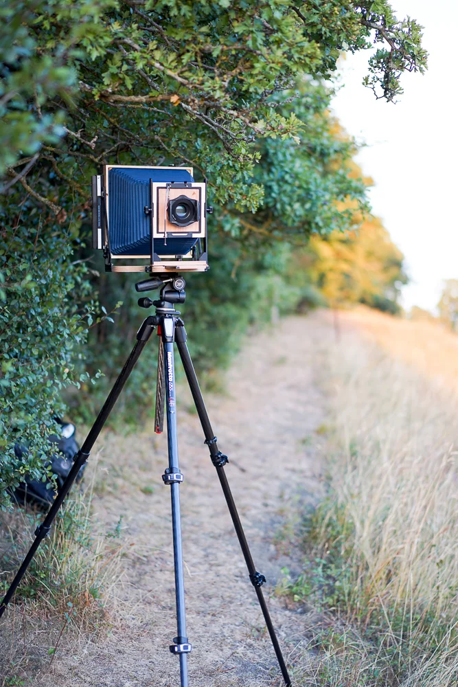
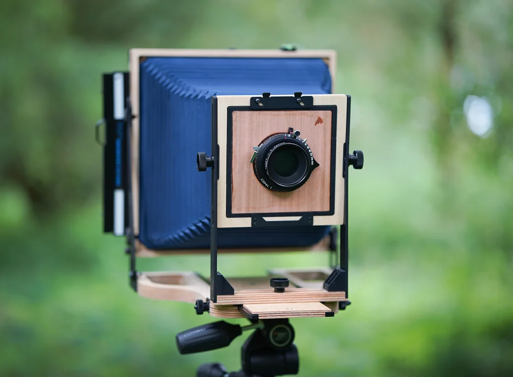
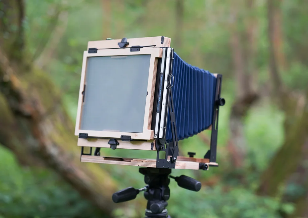
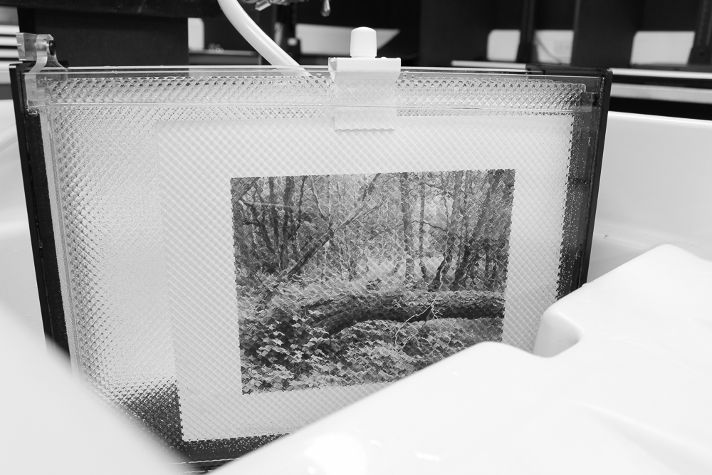
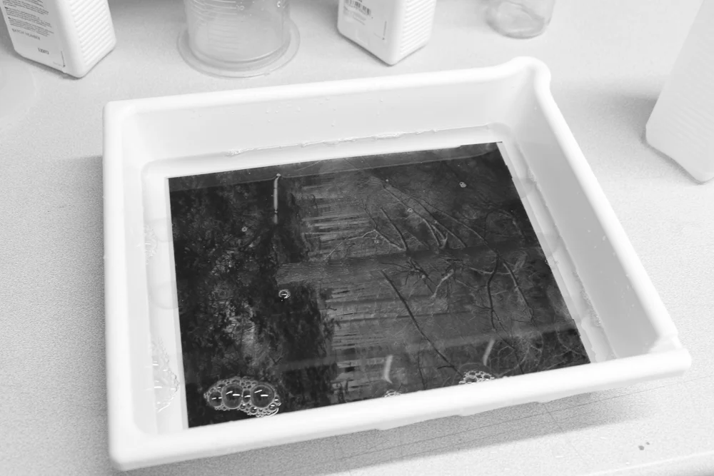
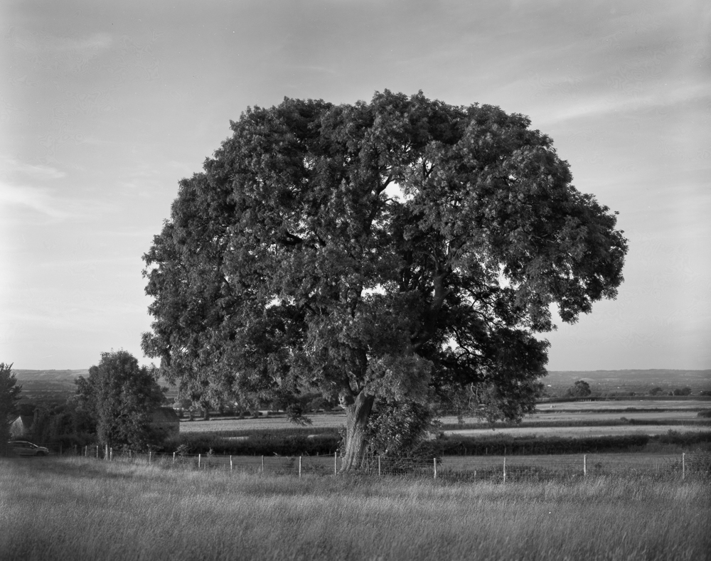
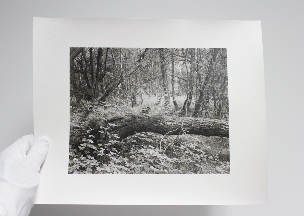
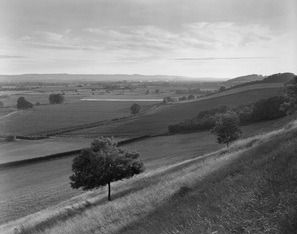
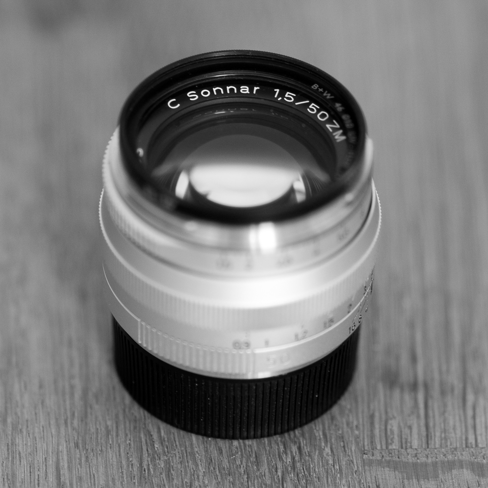
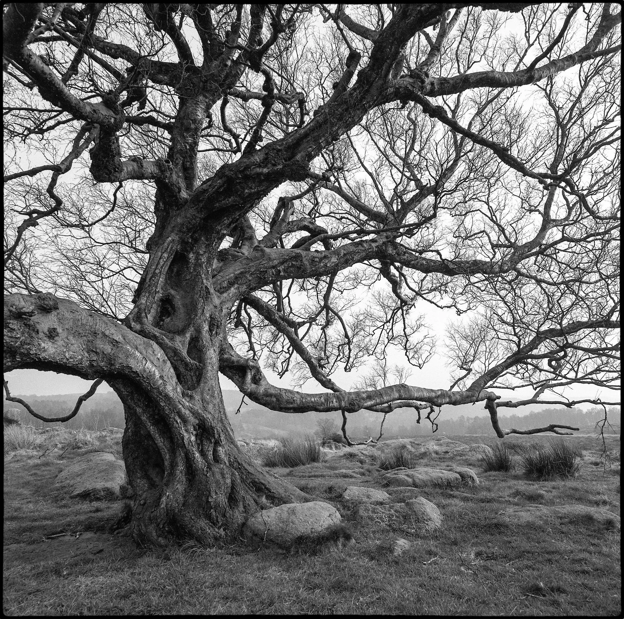
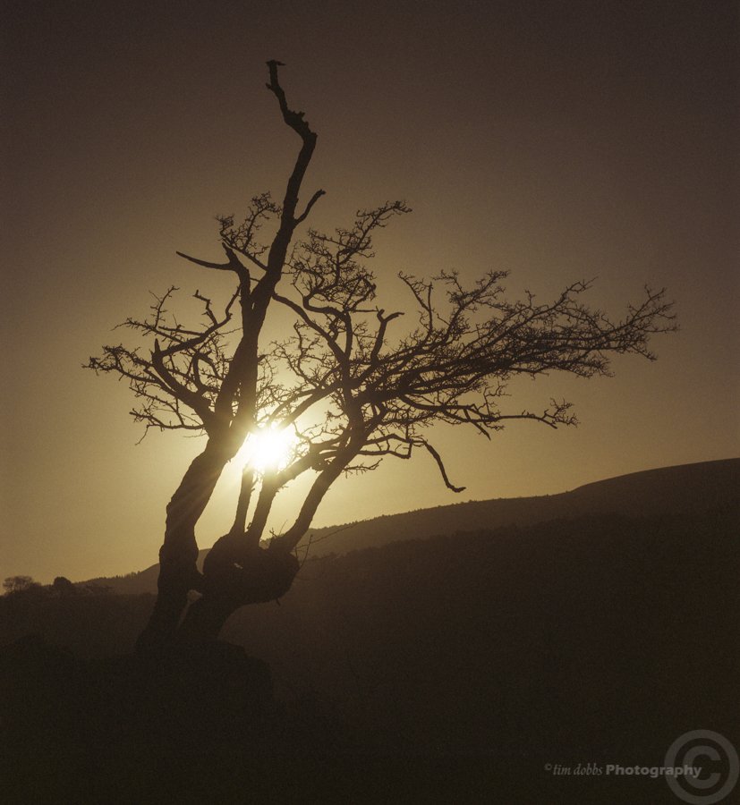
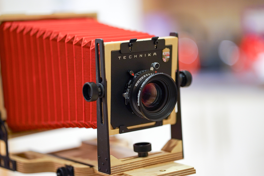
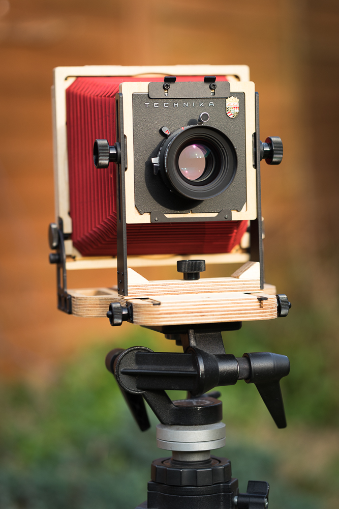
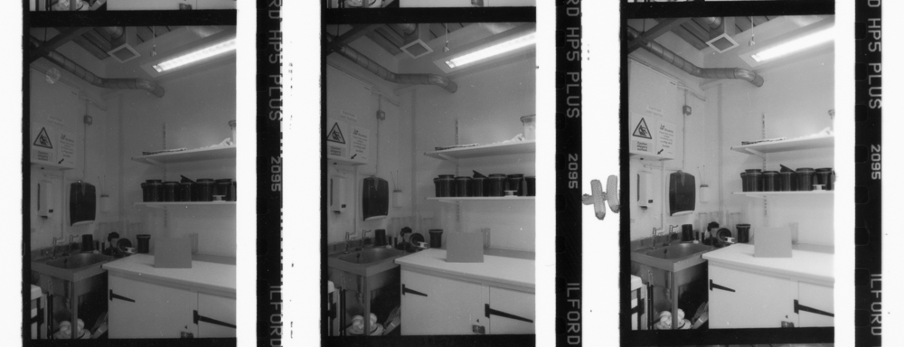
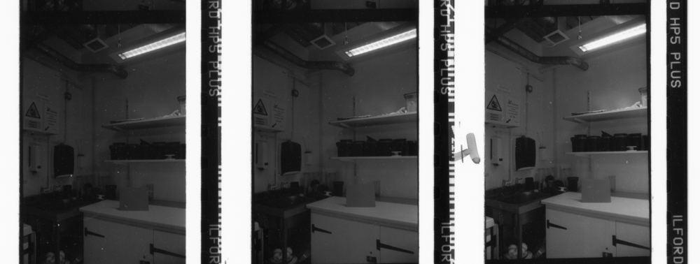
The recent rise in the popularity of analogue photographic media may well be a case in point. I can’t help but wonder whether a key attraction of film is precisely that it frees the photographer from so many of today’s picture making strictures and technical processes. This isn’t to say that film is somehow ‘not technical’ (it is, of course), but there is a directness and rawness that comes from an engagement with film that gives the user a sense of oneness with the medium. Additionally, film demands a commitment in time and inconvenience that a large majority of photography professionals have long turned their backs on in the name of working expedient. I don’t think it’s far fetched to say there is a relationship between the analogue resurgence and amateurism in my qualified sense.

Today, I am indeed happy to be an amateur.


#TreePhotoGallery, Part 2

This week I'm pleased to present #TreePhotoGallery, Part 2.

In Part 1, I gathered together a fine selection of tree photographs by photographers on Twitter. The quantity and quality of submissions following my original call for work was so high that I promised a Part 2 - a promise I happily now keep.

I hope you enjoy the work. 

Tom Rayfield, Walk The Faded Line.

Tom Rayfield, Walk The Faded Line.

Tom's delicate piece cocks a snoot at the notion that central placement is to be avoided. The tonality is stunning: it allows the tree to be 'just' emergent; the viewer continues to do a double-take as the tree shimmers like a grey mirage. There is a tonal lesson too: the range is constrained in the middle values - but just look at its effect! Leading lines are at work from the bottom and the sides.

Matias Takala (@elfsprite), Lone Pine, Ilford HP5+ film.

Matias Takala (@elfsprite), Lone Pine, Ilford HP5+ film.

Matias' image works on so many levels. What a fine juxtaposition of the vulnerable tiny growth in the foreground and the expansive water and forest behind. A successful landscape image so often stands or falls on the foreground-to-background relationship. Matias' image is a great example of how to get it right. 

Analoguephotolab (@analogue_photo), Orwocolour NC19 film.

Analoguephotolab (@analogue_photo), Orwocolour NC19 film.

I enjoy the pale tonality and somewhat humanoid-like posturing of Analoguephoto's trees. It's shot on Orwocolour, a film with an interesting history and idiosyncratic colour palette. I haven't tried it, but from what I've seen I imagine it isn't a film for all occasions. It's an excellent choice here.

Adi Taylor, Twisted, the Owler Tor Tree, Ilford Delta 100 film.

Adi Taylor, Twisted, the Owler Tor Tree, Ilford Delta 100 film.

Great photos take great subjects and add photographic magic. That's exactly the case with Adi's image. Not only is the tree itself brimming with visual interest, but Adi's treatment adds fine tonality and careful composition. The square format can be quite a challenge, but here it reinforces the tree's stocky, powerful form.

Tim Dobbs, A Tree At Sunset, expired Fuji NPS 160 film.

Tim Dobbs, A Tree At Sunset, expired Fuji NPS 160 film.

Some photographs have the power to awaken senses other than just your vision. Tim's monochromatic piece does that for me: I sense a whiff of the early morning fresh air; or the cool rush of the day's end. The sun is carefully positioned, its light breaking through the branches just above the horizon. Like Tom's image above the tonality is subtle, and gives away more as the eye delves deeper and gets accustomed to the lower darkness.

Lina Forrester, Afternoon, freelensed with a 50mm lens and a Nikon D5300 camera.

Lina Forrester, Afternoon, freelensed with a 50mm lens and a Nikon D5300 camera.

A clever use of freelensing by Lina conveys the impression of wavering branches and fragile flowers in this poetic black and white photograph. It has something of a dream-like quality, a moment glimpsed but somehow not quite fixed, as a photograph should. Transience is key.

Sandeep Surmal, Southbank, London, Ilford SFX film with Infrared R72 filter.

Sandeep Surmal, Southbank, London, Ilford SFX film with Infrared R72 filter.

I see so many infrared images in which the effect itself is dominant. They seem to say first and foremost: 'look how infrared transforms our visual world'. Sandeep's image uses the infrared effect, for sure, but it does more photographically, because the effect is in the service of the photo, not the other way around. With their leaves transformed, the trees mirror the lamp posts, leading our eye down the Southbank promenade. The partly ghostly people on the left add a lovely visual punctuation mark.

Lucy Wainwright, Fuji Superia 400 film.

Lucy Wainwright, Fuji Superia 400 film.

Lucy's image is one which reminds me why I enjoy shooting film so much. It's hard to put into words, but the medium, with its bluish cast and gritty grain, add a gravitas to the struggle of the stalwart, gnarly tree. It's an image of survival: of steadfast resistance in the face of nature's unforgiving side.

A fine image to end a fine collection.

Here's a quick link to #TreePhotoGallery, Part 1 in case you missed it.


If you enjoyed my post, you might like to subscribe to my site here

Purchases made with Amazon following the links on my site help me cover costs for posting the content I make. I get a small commission from Amazon at no extra cost to you. Alternatively, you can donate directly hereThank you for your kind support!

Which developer for FP4+ film?

Here's a bit of fun.

I thought I'd run a little developer popularity contest, based on Pebble Project results and FP4+ film (which I have the most results for). I'm asking you to take a stab at your favourite using on-screen results, so no need to be too precious (of course, you may have your experiences to draw on too).

Results to follow!

P.S. Pebble Project gallery can be accessed under 'resources' on the main menu, or just click this link:

Tone: a primer (post 5)

Games to play

Welcome to the final post of my Tone: A Primer series. 

Today I’m going to look at some exercises you can do in order to sharpen your command of tone in black and white. They are suggestions and starting points and can be modified to suit your own practice and equipment. I have endeavoured to ensure that there is material for both film and digital users, although the final exercise is a film one. They are given broadly in order of difficulty.

1. Play with exposure

If you are relatively new to photography, it is well worth beginning with a simple exposure exercise. Try reproducing the modest exercise I explain in post two (under the heading ‘A sliding scale of grey’). Easy to do, but insightful if you are starting out. You are in control of the tones in your images.

2. Shoot black and white things

I have Jevon Tooth to thank for this exercise. When Jevon showed me some of his great black and white prints, it was obvious that he had deliberately targeted black and white objects in order to hone his vision in the medium (e.g. some very lightly toned grasses against a painted black fence). The thought had never occurred to me! A simple but very effective to way get a sense of how black and white tonality can work in crafting images.

3. Strive for tonal variation

For this exercise, I’d like you to prepare and print an image that contains different areas of clearly distinguished tone. Whether you are working with digital or darkroom, the task is to use dodging and burning (or equivalent tools) to help separate distinct zones within the image, and to use this to draw the viewer’s attention to the main subject.

A warmtone darkroom print showing careful modulation of tone, with a strong main subject that is tonally distinct from its environment.

A warmtone darkroom print showing careful modulation of tone, with a strong main subject that is tonally distinct from its environment.

Traditionally, this involves keeping the subject (especially if a person) fairly light tonally (this catches the eye) and to darken surrounding areas, particularly edges, so as to create a frame. Darkened edges are known as a vignette. 

Yet further than this, it is important to make decisions about how to create a sense of contrast between the image zones. Perhaps a very light area of window light needs to burnt-in just a tad, so as to lend a little more solidity to it. Maybe an area at the end of a road in a landscape needs lightening to distinguish it from surrounding trees and to lead the viewer’s eye through the image. Perhaps a little collection of objects near the bottom of the frame is too light and competes with the subject that is more central. Knock it back with a gentle burn-in.

4. Shoot the zones

This exercise was devised by John Blakemore. It assumes some familiarity with the zone system, or, at least with the tones that are demarcated by it. Summaries of the zones and their corresponding descriptions abound on the internet, so one of these is a good place to start.

You begin by choosing a zone and attempt to make a photograph that encapsulates its mood. So, I might choose zone four, say, looking carefully at the tone given in the charts and mulling over the description I have found of ‘average dark foliage, dark stone, landscape shadow’.

The challenge with this exercise - and a challenge it indeed is - is that you are trying to make an image that still holds a range of tones, but that somehow summarises the feeling of the zone in question. You may of course use any development or printing controls you have at your disposal to make the print that you think is appropriate. There is no right or wrong to this, it’s simply a very good exercise for understanding the tonal range available to black and white photographers.

Excepting some of the lighter areas, in particular the cottage, this image strikes me as having something of a zone three / four mood.

Excepting some of the lighter areas, in particular the cottage, this image strikes me as having something of a zone three / four mood.

5. Make a ring-around

For this exercise I’m going to assume that you are using a film (and developer) with some regularity, and that you have a pretty well-established development regime.

You will need to shoot three rolls of film. Firstly, shoot your typical subjects at ‘box speed’ (i.e. the ISO as stated on the film box). For example, if you are shooting HP5+, you would go with 400. It does help to have one or two test subjects (e.g. a given room with consistent lighting) that will provide a reference point across the films.

Next, you shoot more of your typical subjects (re-do that test subject too) but this time at a stop under and a stop over that box speed. You might simply want to change the ISO on your camera, so that you can simply get on with shooting. Therefore, in my 400 speed example, I would shoot some frames at 800 and some at 200. It takes some discipline, but it’s really worth making note of all your exposures as you do this exercise.

When the films are finished you then develop them in the following way. For the first you follow the manufacturer’s guidelines for the developer in question. Opening up my box of HP5+ I find a handy chart which will tell me the time with the developer I'm using. For the next film you add 20 percent to the development time, so as to ‘over-develop’ the film. You may have guessed that for the remaining film you are going to reduce the original manufacturer’s time by 20 percent. This will give you ‘under-development’.

When you are done developing you make a contact print of the results, in your usual manner. In the following image you can see just such a contact print, here showing the ‘normal’ development, and what is labelled +1 and -1, meaning our +20 and -20 percent. I have asked you to do a lot of hard work so far, but already you have a lot of really interesting information. Do you prefer the manufacturer’s development time, or the over- or under-developed version?

Contact print showing 'normal' development (centre), under-development (left) and over-development (right)

Contact print showing 'normal' development (centre), under-development (left) and over-development (right)

Next you can look for frames that you overexposed. What do you think of overexposure and underdevelopment? Or of overexposure and overdevelopment? Which tonality do you prefer? Here is my contact print showing overexposure. The development sequence is the same as the image above, so left under, middle normal and right over.

The underexposed frames then complete the picture. Again, which is the best tonality, for you and your typical subjects? What does the test scene suggest?

There is some more work to do, because this exercise can be brought to a brilliant conclusion. The last step is to print a selection of the images (logically you’d do nine, as suggested by the contact prints above) aiming for the best possible print in each case. In other words, you don’t print them all to some standardised time and grade, but make the best possible print using all the usual controls that are available to you.

You now have a huge amount of information about your shooting and developing regime and with luck some interesting new exposure and development settings to trial over a longer period. You are not stuck with whole stops or indeed 20 percent, but can make further refinements as you progress. Not a quick or easy exercise but potentially a very fruitful one.